Wednesday, 30 July 2014

Website: Additions - The Tree

The Final Addition...at least for now

The aim with the tree was to make it look scary, almost alive like it would reach out and grab you.
That's why I made certain branches similar to fingers. The image is a silhouette rather than coloured because I felt it gives an overall darker feel. 

During the design process I decided that making majority of the branches have points rather than curves gives it a more menacing look.

This will be the last image for now as I really want to focus on 3d modelling.


Thanks for reading. X

Tuesday, 29 July 2014

Website: Additions - The Clown

I took a while looking up different clown images, both cartoon and photographs. After spending some time on one clown idea, I realized it just wasn't looking right. So I ended up saving it and starting a different clown face. This was the result: - 


I went for a different hairstyle than the typical curly haired clown. My aim was to make him look creepy rather than overly scary. The red iris' and yellowed whites add to the eeriness of the face. The bright bold colours used extenuate the white, so everything really stands out.


My next addition is an old tree referencing the forest level.


Thanks for reading. X

Friday, 25 July 2014

Website: Additions - The Shackles


The shackles represent the prison level.
This image was rather time-consuming. I took a lot of time ensuring each link was a similar shape and as realistic as a cartoon chain link can look. After getting to this point I felt I had spent enough time on it.


If I get any extra time later on I may have another go at perfecting each section but for now this is the final piece.


Next up is a clown face.


Thanks for reading. X


Thursday, 24 July 2014

Website: Additions - The Roman Helmet

The next image is a roman helmet. The particular helmet I have been researching is the typical roman officer's helmet.


An all gold helmet would symbolize a higher rank but I preferred the different colours of the lower ranking officer. 


Some elements were a bit fiddly but after doing the basic shape and structure I felt the helmet needed the detailing. Furthermore it was good practice for my next image, shackles, as I know they will be even harder. 


Thanks for reading. X

Monday, 21 July 2014

Website: Additions - The Skull

Originally I was going to go for a more symmetrical simple skull but after getting to that stage and asking a few people they thought it need something else. They suggested some form of deformity so I took the first skull and did quite a few alterations. This works particularly well because the image is a reference to the prison level, where people were tested on and mutilated.


My aim was to create something that represented the game and looked scary, creepy and not quite human. 


To make the skull look inhuman I raised some of the facial features, changed the effects around the outside and distorted the teeth. 


My next piece will be of a roman helmet.

Thanks for reading. X

Saturday, 19 July 2014

Website: Additions - Roman Swords

The Gladius and The Spatha

This roman sword, is called a gladius. the gladius was the primary weapon used by Roman foot soldiers.


This was created in Flash, using many images of roman swords as a point of reference.


I may put blood on the blade later on if I think it would work better on the website.


This long sword is a roman spatha, the hilt has a Celtic design but is different to the Celtic blade, this was used by the cavalry. 

I'm not 100% sure on the shading of the blade but it'll be a quick change if I feel I need to.


Thanks for reading. X

Thursday, 17 July 2014

Website: Additions - The Lollipop

Decorative Cartoon Images

Once I had started prototyping and coding the website I realized it needed something else to add interest. I decided to use Flash over Photoshop as I remember from my first year of university how powerful and easy to use the program is for this sort of thing. I haven't used it for a year and a half so I took a while to get used to the program again.

What I did in Flash and Photoshop?

In Flash, I used tools like the 'line' tool (Shortcut 'N') and the 'selection' tool (Shortcut 'V') to create the curved lines. 
I did run into some problems towards the end as I had forgotten how to save the image as a png file directly from Flash so I attempted the long winded approach. I print screened the image from Flash then pasted it into Photoshop, I used the 'quick selection' tool (Shortcut 'W') , the 'magic wand' tool (Shortcut 'W') and the 'refine edge' panel (Shortcut 'Alt + Ctrl + R') to try and remove the background so only the lollipop will be shown.
What I ended up with is shown below: - 

The First Attempt

When the image is small you can't tell too much but if you enlarge it you will be able to see the rough edges with grey from the tools I used in Photoshop. Just before I was about to spend ages cleaning it up pixel by pixel I decided to double check in Flash if there was any way I could directly save it as a png without the background as I knew it would have smooth edges straight away. Thankfully I looked at export image, which worked wonderfully.


The image below is the one that I saved from Flash.


The Second Attempt

This is the first image in the collection, a strawberries and cream lollipop. Each image will represent a level so the lollipop to the left obviously represents the candy level. There may also be a few that just represent the game as a whole like skulls and blood. 


Each webpage will have a couple of these images to add more colour and content, although I want to ensure that it doesn't look cluttered. My aim is to create images that keep to my own personal style, so they look like they belong in the same collection.

I will next be having a go at a roman sword and and a skull.

Thanks for reading. X

Tuesday, 15 July 2014

Books, Tutorials and Software

Books, Books and More Books

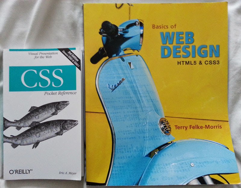
I find books are essential for the work I'm doing. I have so many books on everything from coding to 3D modelling and I'm constantly on the lookout for more decent books.

Here are two that are good for familiarizing yourself with HTML or CSS if you have learnt the basics but haven't coded in a while. The one on the right with the yellow cover was suggested to me when I was coding my first website but it's still useful now. The little CSS book is rather helpful, sometimes if I'm going on long journeys I take it with me to have a look through. It's really well laid out with concise information.


The HTML, CSS and JavaScript book, below, has been really handy, the chapters are well organised and everything is explained well. I've been reading a few pages of the Unity one as well, this one also is very interesting, more so because I haven't used Unity in the past.


I love the Sams Teach Yourself range I also have the 3ds Max and Maya ones too which are also really good, it just covers so much, even if you've used the programs a fair amount they'll be something new in there.


I have found some really helpful videos on YouTube that really explain the lines of code that I need for my website, it's just an unlimited supply of information.

I've been watching and reading some tutorials and information on Unity. I will be focusing on this side of the project more in September but I'm just learning a few bits and pieces until then. I've also downloaded the free version on to my laptop. 


Some Tips I've Learnt

In CSS when you are coding something like a margin you only have to write one line of code even if you want to code all the directions, just remember the order 'Top, Right, Bottom, Left'

Like this: -  margin: 0 auto 20px auto;

(Using auto on the left and right margins will center the div)

This also works in other examples like:-

text-shadow: #000000 0px 1.5px; 'Colour, How far right, How far down, How much blur'

padding: 0 10px; 'One figure for Top and Bottom and one figure for Right and Left'

I just think this is really handy to know as it shortens the amount of code you have to write.

Another tip, may be obvious, but it's really important - Optimizing images. Using a program like Photoshop you can use the button 'Save for the web' and select a size, 800-1000 is perfect for larger images but if you don't mind them smaller then even better. By doing this it avoids the images gradually loading after the webpage has, they should load a lot faster. This is important for both websites and blogs.


Thanks for reading. X

Saturday, 12 July 2014

The Antagonists: The Backstories 3, 4, 5

Getting an insight

The last post showed the backstories for The Tormented and Morigan, here are the other 3: -

Ta'loc

Ta'loc was a being who was admired in his own dimension. He was strong, intelligent and merciful. He was a god among many yet had something special. 

This all changed when he decided that he wanted to be king. Ta'loc honed his strengths for a solid year, when he was ready he attacked the king. Unfortunately for him he didn't succeed so he was bannished to our dimension.

Ta'loc now sacrifices mortals, absorbs their souls to increase his powers. He has no mercy, he fights for himself and his revenge. One day he will find a way home and finish what he started. 


Trajan

Trajan was a warrior. He grew up with three older brothers who were all fighters, they trained him well. His kind were always at war with the humans, he spent a lot of his life fighting other people's battles. Until he fell in love with a human girl, his Arabella, they were happy together. 

Her father, a powerful man, didn't agree with their love so he locked her away and waged a war. Her brother was a renowned soldier who would do anything to keep them apart. Trajan left home to fight for his love, vowing he wouldn't return without her. After much bloodshed he found her. Trajan held his beautiful Arabella in his arms but his happiness was short lived. Her brother saw this, grabbed his sister and sliced her throat. Trajan pushed him out of the way and held his love as she died. He let out a massive roar and teared his enemy apart. 

Trajan, already heart-broken, came back home to find it destroyed. His entire family were killed. His heart was numb. His head filled with pain. He never left the place where his family were killed. He knew the humans would come to him, he was easy to find...but Trajan will kill them all.


Lucy

Lucy was cursed from birth. Her mother was mutated, living only to entertain the wealthy. They were both in cages, the freakshow of the circus. Lucy was constantly laughed at, bullied and treated beyond badly due to her mutated arm.

The mother couldn't stand it anymore. She escaped and rescued Lucy but they were cornered. Lucy was forced to watch as her mother was killed slowly and painfully, whilst her killers laughed gleefully.

Lucy was angry, she used her small size to her advantage and killed everyone, taking her time with the people who had hurt her.

Lucy knew she would have no chance outside of the circus. Having no where to go she lives in the circus, preparing for her next victims.


Thanks for reading. X

Thursday, 10 July 2014

The Antagonists: The Backstories 1 and 2

Getting an insight

Each character needs a backstory. A reason why they act the way they do.
It brings them to life, allowing the player to delve into a different side of these characters, providing a stronger in game experience. 
My aim is to write a concise yet descriptive story for each, 500 - 1000 words per antagonist.
Here are two backstories I have drafted, they haven't been polished yet but show the bare bones of the characters'  lives, Morigan's story is a bit long at the moment but when I can gauge the lengths of the other stories I will make them all a similar word count.


The Tormented

A small orphaned baby was left abandoned; he had no one, no possessions and no hope. One night a man found the boy close to death with strange disfiurations on his face and body. The boy was taken to a prison camp where scientists ran tests on him, added other parts so he was no longer human. He never left the prison, he couldn't, they embedded a chip into his nervous system, if he got to close to the iron gates he would feel unimaginable agony. He grew into a young man who knew no other life, just pain and suffering. He was alone.

One cold night the guards were drinking and taunting him with food. Anger coursed through his veins, it unlocked an animalistic strength he had never felt before, he was hungry, very hungry. The Tormented broke free from his cell and ripped the guards to shreds. There was a massacre, the screams could be heard for miles as The Tormented gave no mercy, devouring everyone in the prison.

The Tormented tried to leave but he almost killed himself, he was paralyzed for days as the shock surged through his body, he was trapped. He eventually made the prison his home, brutally killing anyone who tries to enter.


Morigan

A woman born with a heart of pure evil. 

Morigan killed her younger sister, Lilian, when she was five years old. On Lillian's 3rd birthday she was given a doll that Morgian wanted. She grabbed the doll from her sisters hands and pushed her into the fireplace. Lilian's screams were eventually heard by their parents who came running in. Morigan just watched. Lillian had severe burns all over her face and body. After 3 days of agony she died. 

Morigan's parents were grieve stricken over the loss of their daughter but believed it was an accident. They had been the greatest candy makers for miles, people would come from far and wide to try their unique creations but it was all falling apart. They smothered Morigan too much; they kept an eye on her all day everyday, she wasn't allowed to go out and she was frequently nagged about staying safe. Morigan had had enough. After school she searched for her mums' sleeping draught. With a grin on her face she ground up all the pills and when her mother was cooking dinner Morigan poured it in. She waited for her parents to go to bed then snuck out into the factory adjoining the house, where the candy was made, and heated up the syrup. When syrup was boiling she carefully lifted the vat and made her way to her parents bedroom. With one swift motion she poured the entire contents on both her parents. They screamed but couldn't move, after 10 minutes they were unconcous and eventually died. 

Higher beings had been watching her, waiting. After the last action of evil they transported her to her own personal hell. 
Anyone can stumble into the garden of sugar, it isn't well known throughout the all the deminsions. People can get lost when getting from one to the other. As Morigan increases her powers she can alter certain passage ways. The lost are the easiest to hunt.

Morigan uses her good looks to attract men to ensure her immortality, with one touch she absorbs there souls as they writhe in agony. She has learnt to use the candy surrounding her to entice children. Morigan then traps the children and uses their innocent souls to bring her gingerbread men and gummy bear slaves to life. They are forced to work day and night answering to her every whim and ensuring that more victims come to the deadly garden of sugar.

Thanks for reading. X

Tuesday, 8 July 2014

The Website: The Characters Prototype

The Webpage Photoshop Prototype

Here are a selection of designs I have thought of for the character page on the website. The designs below will show the basic layout designs as I wanted to focus on this before incorporating the use of color.

After sketching the designs on to paper I planned them out using Photoshop. Through the process I was thinking about what information the users would be interested in after the first two designs I thought the users may want to know how the characters evolved so I included the timeline element and places for text to describe the creative process.

I spoke to few people, of varying ages, which design they preferred. The discussion covered use of images versus text, usability, the information presented and coding difficulty of particular elements. We weighed the pros and cons then reached a decision. So here are the designs: -


Design 1


The first design I came up with is very simple. I have shown three characters as the rest would be self-explanatory, all 5 would be in the same layout. The images are placed next to each piece of text laid out in an alternating fashion as they go down the page. The images will be clickable and bring up a large version of the image with 'Lightbox'. 


Design 2


This design is a bit more advanced, the small squares on the left represent the images of each character. When one of these images is clicked the respective image for that character will appear in the larger box and the text will show the back-story for that antagonist. The main image can be clicked to show the image larger with 'Lightbox'.


Design 3


The approach for this design is different than the first 2. The 4 images along the top will be of each stage of the character, like a timeline. The text will give the back-story about the character and bit about the creating process. The 5 images along the bottom are links for each of the characters to change the timeline to each respective antagonist.


Design 4


This design has a vertical second navigation bar, each name is a link. The 4 images are a timeline of the creation stages, from sketch to a developed digital painting. The back-story and technical side are separated to allow for more information. The images, like on the other designs, will be clickable and produce a larger image with 'Lightbox'.

Design 5 


Similar to the 4th design but this design has a horizontal second navigation bar. The 4 images are a timeline of the creation stages. This layout does mean the text is clearer. Of course, 'Lightbox' will also be used.


Design 6 - The Final


I spoke to a few people about the designs and they all preferred the 4th design. Although we did discuss how certain people may not be interested in the creative process so it would be better to have that as a separate link on the page. This allows for more room to showcase the main image and the character's back-story. I definitely wanted to put in the creative process as there will be people that would find this interesting, especially gaming enthusiasts. The four images on the bottom left hand side will be small, perhaps cropped, images from the antagonist's timeline to give the user a taster. The images will be clickable and bring up a 'Lightbox' of the whole timeline with text about the process.

Thanks for reading. X
Saturday, 5 July 2014

The Website: General Layout

The Basics

Here is the basic layout for the website.


  • The header will have the title of the game, not yet decided, in an art format using Photoshop.
  • The artwork on either side of the site will be of certain elements from each level of the game like a circus tent, a temple, trees, chains and sweets.
  • The footer will be kept simple with basic information such as the copyright symbol, my email address and possibly some social media icons for links to twitter and Facebook. 
  • The navigation bar will have a raised effect to make it stand out, perhaps using a drop shadow. 
    • The Home page will be a welcome screen with images and text enticing the audience in.
    • The Game webpage will hold the actual game the users will play, they will have the option to make the game full screen or smaller surrounded but the website.
    • The Characters page will give the audience an insight into the background of the  characters along with images.
    • The Blog page will take them here so they can find out about the process of the project from beginning to end.
    • The Downloadable Content page is not a definite decision yet. The page will include some text explaining it's use, a textbox for entering a code and a 'Go' button. If a correct code is entered a folder will appear along with a congratulatory message. The folder will contain content such as game related artwork the player can download and use as a desktop background. 
      • The page is one of the ways I have thought of to allow the player to download this content without disrupting the flow of the game. So this is how it would work: -
      1. The player would play a level and find an Easter Egg.
      2. Once they have completed that level a message and code will appear in the game.
      3. They can either memorize the code or write it down (the code will be short and memorable) to put in later.
      4. The player could also open a new tab with the downloadable content page and enter it in straight away if they are eager.
      • This is of course just an idea at the moment so if I can find a better way of doing this the downloadable content page may not be used.
  • The toolbar on the left hand side is rudimentary at the moment but the idea behind it is accessibility. The tools I have put on there so far are a contrast button and a text sizer. The contrast button is for people with color blindness and the text sizer is for people who may not have strong vision. The toolbar will be floating so if the user scrolls down a page it will follow them in the centre left hand side of the screen. I want the toolbar to have a minimize feature so that users can remove it if it becomes annoying.
  • The resolution for the design is the most common 1024 x 768 but I will also look at how other screens will present it especially wide screen monitors as they are becoming increasingly popular particularly with gamers.
  • The colour palette for both the artwork and website will be dark and earthy to complement the darkness and horror elements within the game. It will also provide a strong contrast with the white text.
  • The text will be white with a drop shadow to make it stand out and become easy to read.

Thanks for reading. X

Wednesday, 2 July 2014

The Game: Names

A Hard Decision 

I have been trying to come up with a name for my game. It has been really hard and I haven't found the perfect name yet so it'll be something I continuously think about through the game-making process. I really want a name that encompasses all the games' elements; the evil antagonists, the dark atmosphere, the fear and the level themes.

Some Research

I have done some research into choosing the game name, it is important to choose a name that is easy to spell and pronounce. Furthermore, a name that is memorable and isn't to similar to something else that exists. It is also important that it is spelt the same in other English speaking countries, for example in England we spell 'colour' like this but in America they spell it like this 'color'.
  

Ruled Out...

Here are a few that I have already ruled off but I may use specific elements from them: -

Territories - I thought this up because the five antagonist are very territorial but I feel it doesn't give off the dark horror element.
The Five - This was thought of due to the fact there's 5 levels, 5 antagonists and 5 collectibles but like the one above it doesn't give off the horror element.
They Will Hunt You - I liked this because it could provoke fear but I feel it's too long.
Alone in the Dark - I love this name but I found out it is already a movie and a game.


Alliteration 

I like the idea of having alliteration in the name because it will be memorable and roll of the tongue. Here are some examples I have thought up: -

Delve into the Darkness
Face the Fears
Horrors of the Hunt


Others...

Here are some others: -

Journey into Madness
Into the Darkness
Alone...or are you?
Survive the Horrors
Face the Horrors
Face the Darkness
Lost in the Dark
Killers in the Dark
Escape the Dark
Run.
The Evil in the Dark
Revenge of the Tormented

I feel that some of these names are good but I am not 100% satisfied yet so I'll keep thinking.


Thanks for reading. X

Tuesday, 1 July 2014

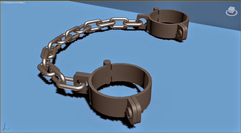
3d Modelling: The Shackles

Doing some 3D modelling!

I haven't used 3ds Max in a good month, also I now have the 2015 version rather than the earlier one, which I was used to. I felt I needed to have a go at some modelling to familiarize myself with all the old tools and the new additions. 

I decided to create the shackles that will be used as a collectible item within the game.


I used the Snapshot tool, in the Tools section of the navigation bar, to create the chain links. The cuffs were a bit more complicated, I used a circle spline with a thickness to get the basic shape then used tools like Extrude, Chamfer and Procutter to create the rest of the piece.

I've gone for a simple style trying to keep the polygon count low so that it doesn't affect the game's rendering time. I have put simple metal textures on the model but I'm still not 100% happy with them yet so I'll probably play around with them a bit more. The textures can also affect render time if they're to complex so I want to keep them simple yet effective.

Thanks for reading. X