Showing posts with label Multimedia. Show all posts

Tuesday, 15 July 2014

Books, Tutorials and Software

Books, Books and More Books

I find books are essential for the work I'm doing. I have so many books on everything from coding to 3D modelling and I'm constantly on the lookout for more decent books.

Here are two that are good for familiarizing yourself with HTML or CSS if you have learnt the basics but haven't coded in a while. The one on the right with the yellow cover was suggested to me when I was coding my first website but it's still useful now. The little CSS book is rather helpful, sometimes if I'm going on long journeys I take it with me to have a look through. It's really well laid out with concise information.
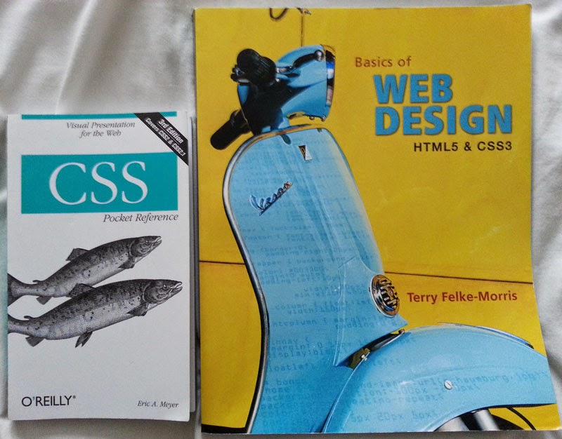


The HTML, CSS and JavaScript book, below, has been really handy, the chapters are well organised and everything is explained well. I've been reading a few pages of the Unity one as well, this one also is very interesting, more so because I haven't used Unity in the past.


I love the Sams Teach Yourself range I also have the 3ds Max and Maya ones too which are also really good, it just covers so much, even if you've used the programs a fair amount they'll be something new in there.


I have found some really helpful videos on YouTube that really explain the lines of code that I need for my website, it's just an unlimited supply of information.

I've been watching and reading some tutorials and information on Unity. I will be focusing on this side of the project more in September but I'm just learning a few bits and pieces until then. I've also downloaded the free version on to my laptop. 


Some Tips I've Learnt

In CSS when you are coding something like a margin you only have to write one line of code even if you want to code all the directions, just remember the order 'Top, Right, Bottom, Left'

Like this: -  margin: 0 auto 20px auto;

(Using auto on the left and right margins will center the div)

This also works in other examples like:-

text-shadow: #000000 0px 1.5px; 'Colour, How far right, How far down, How much blur'

padding: 0 10px; 'One figure for Top and Bottom and one figure for Right and Left'

I just think this is really handy to know as it shortens the amount of code you have to write.

Another tip, may be obvious, but it's really important - Optimizing images. Using a program like Photoshop you can use the button 'Save for the web' and select a size, 800-1000 is perfect for larger images but if you don't mind them smaller then even better. By doing this it avoids the images gradually loading after the webpage has, they should load a lot faster. This is important for both websites and blogs.


Thanks for reading. X

Saturday, 5 July 2014

The Website: General Layout

The Basics

Here is the basic layout for the website.


  • The header will have the title of the game, not yet decided, in an art format using Photoshop.
  • The artwork on either side of the site will be of certain elements from each level of the game like a circus tent, a temple, trees, chains and sweets.
  • The footer will be kept simple with basic information such as the copyright symbol, my email address and possibly some social media icons for links to twitter and Facebook. 
  • The navigation bar will have a raised effect to make it stand out, perhaps using a drop shadow. 
    • The Home page will be a welcome screen with images and text enticing the audience in.
    • The Game webpage will hold the actual game the users will play, they will have the option to make the game full screen or smaller surrounded but the website.
    • The Characters page will give the audience an insight into the background of the  characters along with images.
    • The Blog page will take them here so they can find out about the process of the project from beginning to end.
    • The Downloadable Content page is not a definite decision yet. The page will include some text explaining it's use, a textbox for entering a code and a 'Go' button. If a correct code is entered a folder will appear along with a congratulatory message. The folder will contain content such as game related artwork the player can download and use as a desktop background. 
      • The page is one of the ways I have thought of to allow the player to download this content without disrupting the flow of the game. So this is how it would work: -
      1. The player would play a level and find an Easter Egg.
      2. Once they have completed that level a message and code will appear in the game.
      3. They can either memorize the code or write it down (the code will be short and memorable) to put in later.
      4. The player could also open a new tab with the downloadable content page and enter it in straight away if they are eager.
      • This is of course just an idea at the moment so if I can find a better way of doing this the downloadable content page may not be used.
  • The toolbar on the left hand side is rudimentary at the moment but the idea behind it is accessibility. The tools I have put on there so far are a contrast button and a text sizer. The contrast button is for people with color blindness and the text sizer is for people who may not have strong vision. The toolbar will be floating so if the user scrolls down a page it will follow them in the centre left hand side of the screen. I want the toolbar to have a minimize feature so that users can remove it if it becomes annoying.
  • The resolution for the design is the most common 1024 x 768 but I will also look at how other screens will present it especially wide screen monitors as they are becoming increasingly popular particularly with gamers.
  • The colour palette for both the artwork and website will be dark and earthy to complement the darkness and horror elements within the game. It will also provide a strong contrast with the white text.
  • The text will be white with a drop shadow to make it stand out and become easy to read.

Thanks for reading. X

Wednesday, 2 July 2014

The Game: Names

A Hard Decision 

I have been trying to come up with a name for my game. It has been really hard and I haven't found the perfect name yet so it'll be something I continuously think about through the game-making process. I really want a name that encompasses all the games' elements; the evil antagonists, the dark atmosphere, the fear and the level themes.

Some Research

I have done some research into choosing the game name, it is important to choose a name that is easy to spell and pronounce. Furthermore, a name that is memorable and isn't to similar to something else that exists. It is also important that it is spelt the same in other English speaking countries, for example in England we spell 'colour' like this but in America they spell it like this 'color'.
  

Ruled Out...

Here are a few that I have already ruled off but I may use specific elements from them: -

Territories - I thought this up because the five antagonist are very territorial but I feel it doesn't give off the dark horror element.
The Five - This was thought of due to the fact there's 5 levels, 5 antagonists and 5 collectibles but like the one above it doesn't give off the horror element.
They Will Hunt You - I liked this because it could provoke fear but I feel it's too long.
Alone in the Dark - I love this name but I found out it is already a movie and a game.


Alliteration 

I like the idea of having alliteration in the name because it will be memorable and roll of the tongue. Here are some examples I have thought up: -

Delve into the Darkness
Face the Fears
Horrors of the Hunt


Others...

Here are some others: -

Journey into Madness
Into the Darkness
Alone...or are you?
Survive the Horrors
Face the Horrors
Face the Darkness
Lost in the Dark
Killers in the Dark
Escape the Dark
Run.
The Evil in the Dark
Revenge of the Tormented

I feel that some of these names are good but I am not 100% satisfied yet so I'll keep thinking.


Thanks for reading. X

Tuesday, 1 July 2014

3d Modelling: The Shackles

Doing some 3D modelling!

I haven't used 3ds Max in a good month, also I now have the 2015 version rather than the earlier one, which I was used to. I felt I needed to have a go at some modelling to familiarize myself with all the old tools and the new additions. 

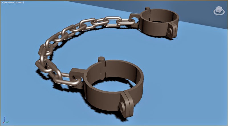
I decided to create the shackles that will be used as a collectible item within the game.


I used the Snapshot tool, in the Tools section of the navigation bar, to create the chain links. The cuffs were a bit more complicated, I used a circle spline with a thickness to get the basic shape then used tools like Extrude, Chamfer and Procutter to create the rest of the piece.

I've gone for a simple style trying to keep the polygon count low so that it doesn't affect the game's rendering time. I have put simple metal textures on the model but I'm still not 100% happy with them yet so I'll probably play around with them a bit more. The textures can also affect render time if they're to complex so I want to keep them simple yet effective.

Thanks for reading. X

Saturday, 28 June 2014

The Levels: Elements and Inspiration


Each level is open world to an extent, the player will be able to go anywhere at anytime within the 'cube' of the level. All the levels are set a night, although some areas will have lighting so won't be as dark. The player will move to the next level once they have picked up all the collectibles within that level.

Level 1 

Demolished Prison theme
Antagonist: The Tormented (Disfigured creature) 
Elements: 
              Ruined Buildings - There will be a lot of these, some more destroyed than others
              Prison Cells - Some will be broken apart, others with skeletons in them
              Infirmary Tent - Showing experiments were performed
              Concrete Walls topped with Barbed Wire - There is no escape!!
Overall Concept: The idea is to show the antagonist was created within the prison and was a prisoner until he broke out, destroyed everything and killed everyone.
Colour Scheme: Dark and Matte - Greys, Browns, 
Inspiration: This particular level was inspired by the antagonist as I created The Tormented and thought up the level theme from his look and feel. I wanted a character with his mouth sewed shut and lots of chains round his body so from there I thought up a rough 'back-story', I felt a prison really fit this. 

Level 2 

Candy theme
Antagonist: Morigan (Old woman)
Elements: 
              Lollipops / Sweets - Giving off the strong candy theme
              Chocolate - Perhaps a chocolate fountain or river
              Gingerbread House - An inside area to explore
Overall Concept: The elements in the level will be fun and enticing, but the dark undertones will add tension. There will be a few surprises to add fear and throw the player off track.
Colour Scheme: Bright and Pastel - Pink, Orange, Blue
Inspiration: The main inspiration for this level came from Katy Perry's song (featuring Snoop Dog) California Gurls, I love the candy theme, it looks so aesthetically appealing. I want to recreate this but have a horrific twist that really contrasts with the overall 'pretty and delicious' theme.

Level 3 

Forest theme
Antagonist: Ta'loc (Non-Human)
Elements: 
              Sacrificial Burial Grounds - There will be different sacrifices - in type and method
              Tombs - Inside areas that can be explored 
              Alien Artifacts - Statues and otherworldly objects
Overall Concept: At first the forest will look fairly normal but full of alien things that will be creepy, scary but also interesting. The sacrifice areas will be very gruesome and make you wonder what the antagonist is and why it does these things. The antagonist is silent in this level so it'll be even more nerve-racking.
Colour Scheme: Dark and Natural - Green, Brown, Grey
Inspiration: Like the first level this theme was based on the character, which I created before the overall level idea. I really liked the idea of an antagonist that isn't of this world, once I decided I wanted a forest theme and linked it with the Ta'loc character the whole level came together with the alien and otherworldly concept. 

Level 4 

Roman theme
Antagonist: Trajan (Half man/half beast)
Elements: 
              Temples - Some will give inside ares to explore, others will be ruins
              Mythological Statues - Statues that represent known gods, may make my own too
              Pillars - To show pathways, ruined buildings and decorative effect
              Spears / Other Weapons - Near skeletons or as decorations
              Skeletons / bodies - To show there was a battle and that time has past
Overall Concept: The look I am aiming for is an ancient town / city that has stood for hundreds of years but was taken over by the antagonist. I want to also create certain elements from imagination but that are inspired on my research into Romans and mythology.
Colour Scheme: Dark and Strong - Grey, Red, Gold, Orange
Inspiration: This level was, again, loosely based on the antagonist character design. I pictured the creature to have amour pieces similar to the Romans. I love the colour scheme of red and gold, which is heavily used for Romans. The level concept has also drawn inspiration from Essos in Game of Thrones (where Daenerys is based) because I love the colour palette of the location and the overall feel of the environment. I have looked up some temples that I may recreate like the Temple of Faustina and the Pantheon.

Level 5 

Circus theme
Antagonist: Lucy (The young girl)
Elements: 
              Maze - The primary element is a huge circus-themed maze
              Mirrors - Will cover some of the walls of the maze
              Ferris Wheel - Will 'turn on' when player is close, to make them jump/add tension
              Bouncy Castle - Will be gruesome inside
              Clowns - There will be creepy clown imagery throughout the environment
Overall Concept: I want this level to be the most terrifying, it will be full of jumpy parts, gruesome areas and the maze will add the feeling of being lost. When the Ferris wheel turns on it will be loud and bright, which will alert the antagonist.
Colour Scheme: Bright and Basic - Red, Yellow, Blue
Inspiration: This was the last level to be decided as I was torn between a circus theme and a hospital theme. I knew both would be scary but I decided to go with the circus concept because I could see it as being more creepy. I am one of the many people who are scared of clowns so I know that this will add to the fear factor within the game. I didn't want to have a clown as the antagonist because I feel the player would expect that.


Thanks for reading. X

Wednesday, 25 June 2014

The Levels: Themes and The Collectibles

The Levels

Here are each of the level themes I have chosen, the order may change a bit but this should be close to the actual play through. I'll put a description of each character in brackets so you know who I mean.

Level 1 
Demolished Prison theme
Antagonist: The Tormented (Disfigured creature) 

Level 2 
Candy theme
Antagonist: Morigan (Old woman)

Level 3 
Forest theme
Antagonist: Ta'loc (Non-Human)

Level 4 
Roman theme
Antagonist: Trajan (Half man/half beast)

Level 5 
Circus theme
Antagonist: Lucy (The young girl)

The Collectibles

In each of the levels there will be 5 collectibles that will allow the player to progress to the next level. The collectibles will be hard to find but glow slightly to show the player that they need to pick them up. There will also be an easter egg that unlocks special downloadable content. Each collectible represents a level and is styled as such this will give the player an idea of whats to come as they play through the levels. 
Here is the list: -

Shackles
Gummy Bear
Alien Object
Bust
Doll

The Easter Egg: An inanimate miniature of the respective antagonist for the level, for example for the circus level the easter egg will be a miniature version of Lucy.

I will be focusing on the individual levels in the next post, to get an idea of the objects and atmosphere within each level.

Thanks for reading. X

Saturday, 21 June 2014

Software and Tutorial Sites

Adobe Software

The past few days I have been debating which version I should use CS 5.5, CS 6 or the Creative Cloud. CS 5.5 would've been the cheaper option since my friend owns a copy but I decided to go with the Creative Cloud, at £15.88 a month, it's such a good deal because you get all the latest Adobe programs including Photoshop and Dreamweaver.


Autodesk Software

I have been working with the 2013 and 2014 versions of 3DS Max for the past two years. I decided to install the newest version, 2015, for this project, as I wanted all the latest features and my laptop is powerful enough for it.


Tutorial Sites

I have been looking at different tutorial sites here are some good ones : - Tuts +, Digital Tutors, Lynda.com, 3D Buzz, Unity 3D Student and Ctrl+Paint. The last two are free to use. Ctrl+Paint is amazing! It focuses on graphic painting in Photoshop, it's incredibly helpful. The other sites mentioned are also great, they are more broad covering things like 3D modelling, game development and website development, although they do cost money. I have used Digital Tutors for the past year or so on other projects, I really like the way each tutorial is divided into separate shorter videos, which makes it easy to follow especially for the more advanced topics.

Thanks for reading. X


Monday, 16 June 2014

Graphic Design: Tablet Research

You've guessed it... I have been looking at graphic tablets for the digital painting side of my project.


Wacom vs Other Brands 

Wacom is, of course, the most well known brand of tablet. After doing research into other options I found Monoprice, Huion and a few others that are less well known but cheaper. After reading some reviews and much contemplation I decided to go for the Wacom brand. I know their products are of a good quality and I didn't mind spending a bit more to get a better product.


intuos vs bamboo

After deciding I was going to go for the Wacom brand I was faced with this dilemma : - intuos vs bamboo. There was an obvious price difference between the too and after some research it seemed there were certain attributes the bamboo lacked, for example a lower pressure sensitivity, less ergonomic and you can't program shortcuts for each individual program. I really want to make sure I have a great quality product and I didn't mind spending a bit extra, the intuos has had some great reviews so I decided that this was the tablet for me.


Small vs Medium

I went for a medium size graphic tablet because I wanted to have a bigger active area for larger images and the ability for a wider range of motion.


Draw with Jazza

Whilst researching graphic tablets I stumbled across this YouTube channel. This video in particular, Digital Tablets! - How Much, Why, Who, etc., really helped me make my decision. 
I would also like to add that his YouTube channel is amazing, he is a very talented graphic artist and I will be watching his videos a lot in the coming weeks.


Thanks for reading. 

X


Friday, 13 June 2014

Game Research: Antagonists

Researched Antagonists for Inspiration


The Joker

He is an iconic character in the Batman franchise, his personality, look and laugh are very memorable. He is the perfect villain because he doesn't have a hidden agenda for money or power he just wants to see the world burn. The Joker's visual appearance has a really creepy element, the over-the-top make-up and facial scarring really match his crazy personality.

https://tangynt.wordpress.com/tag/the-joker/


Lord Voldemort

This villain is a great example of a non human character, he use to be human but he divided his soul to become immortal so now he is another being entirely. He is evil and powerful with a full-on back story that all Harry Potter fans will know. Voldemort has certain human-like features like the shape of his head and the position of his eyes and mouth. He also has snake-like features like his nose and the slightly scaled affect on his skin. 
http://dumbledoresarmyroleplay.wikia.com/wiki/File:Voldemort.jpeg

Professor Umbridge


She is probably more hated than Lord Voldemort in the Harry Potter franchise, due to her personality, overly harsh punishments and sickly sweet voice and look. Umbridge's visual appearance may be deceiving, she looks like an older aunt with her well groomed grey hair, knitted pink clothes and heavy pink lip-stick yet her posture and movements suggest her darker personality.


http://harrypotter.wikia.com/wiki/File:Dolores_Umbridge_(Promo_still_from_HP5_movie)_10-15-2009.jpg

Slenderman


He has such a simple character design yet he is really scary in the Slender Games. The fact he doesn't have a face is rather chilling, he doesn't have eyes yet you feel he is staring at you. Sometimes simplicity really does pay off.


http://camusaltamirano.deviantart.com/art/Slenderman-353586833


Clickers (The Last of Us)


When playing The Last of Us the most terrifying monster you come across are the Clickers. You will hear them before you see them, the noise they make is just as scary. On top of this they are really hard to kill. As you can see from the image these characters are very disfigured but were clearly once human.
This video shows you how scary the noise they make is, especially when you're in a dark environment.


http://www.psu.com/a018184/Meet-the-Clickers-and-Runners-two-Infected-in-The-Last-of-Us

King Joffrey


Even though this character isn't visually scary, he has a very sadistic and malicious personality. Anyone who has watched Game of Thrones or read the books will hate this character a great deal. King Joffrey's acts of aggression aren't usually provoked he just enjoys causing pain, which makes him even more evil.


http://de.gameofthrones.wikia.com/wiki/Datei:Joffrey.jpg


My Antagonist ideas

I will create 5 antagonists, one for each level of the game. 

All the villains I have researched are memorable in their own way, I hope to design unique characters that have the same impact.

Here are some traits that I have been thinking of including: - Sweet looking, scarring, dominating, half animal and an alien type creature. I will keep coming up with more ideas, I am in the creative thinking and note taking phase at the moment.

I want my characters to have personal voices or noises that the player will associate with them, when the antagonist is getting closer to the player this noise will get louder, to add intensity.

Thanks for reading...I'm off to look at graphic tablets. X

Disclaimer - I don't own any of the images in this post.

Tuesday, 10 June 2014

A Little Introduction

Hi...


I have started this blog to document the journey I take through the development of my project. The sheer size of the project means I have to remain organised throughout the process so I will use this blog as a way to ensure I stay on track.


What is it?

As I have mentioned in the description the project I am working on is a website and a horror game.


Why?

I have chosen this project because it gives me a lot of scope to increase my skills in so many different areas from HTML coding to digital painting. Also, I really want to go into either the website development industry or the gaming industry when I have finished my university degree.


How long? 

I have around 43 weeks to complete this project.


What software?

The programs I plan to use are Adobe Photoshop, Adobe Dreamweaver, Autodesk 3DS Max, Autodesk Mudbox and Unity. 
The coding languages I will be using are HTML 5, CSS3, Javascript and C#.
There may be other programs and languages I decide will be useful later down the line but these are the main ones.


What hardware?

After looking everywhere for a laptop that meets all of my requirements I eventually found PC Specialist through a classmate. This site is incredible, I was able to enter in all my requirements and end up with the perfect laptop for me at a decent price.


Lets begin...